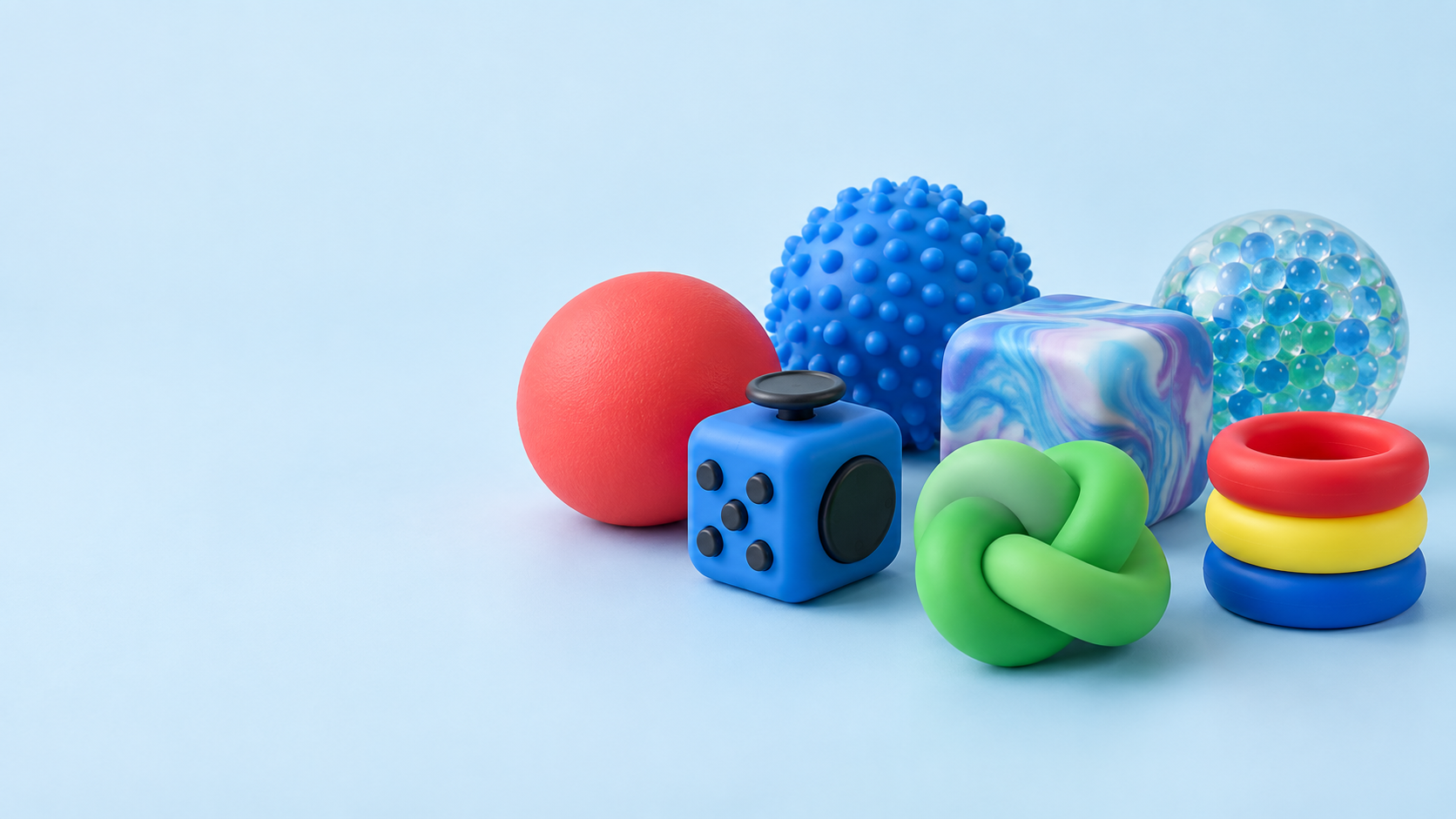
Stress relief toys look simple at first glance. A buyer sees a soft ball, a click cube or a textured form; a successful order requires a clearer chain of decisions. The product must make sense for its user, work within a commercial programme, communicate the brand appropriately and arrive in a condition that can be inspected with confidence. This guide is a reusable single-page blog template for those decisions.
1. Start with the buyer and use case, not the first product image.
A reference image is a useful starting point, but it is not a complete sourcing brief. Before selecting a format, clarify who will receive the product and what role it is expected to play. A small desk toy for an office-wellness campaign is selected differently from a brightly packed novelty item for a retail shelf. The interaction may overlap, but the commercial context does not.
For retail buyers, consider the shelf, the price architecture and the reason a shopper might pick the item up. Is the product an impulse add-on, part of a sensory assortment, a giftable item or a repeat-purchase novelty line? Those questions influence size, perceived material quality, presentation and how much product information has to be carried by the pack.
For promotional buyers, start from the campaign setting. A useful item handed out at an event has to travel well, make the brand visible and feel relevant beyond the moment of distribution. A product intended for a wellness programme may need a calmer visual direction than one supporting a youth-facing product launch. The right object supports the message without becoming an overcomplicated giveaway.
Questions that improve the first conversation
- Who is the intended user, and where will the product be used?
- Is the primary goal retail sell-through, brand recall, event distribution or employee engagement?
- What quantity, target market and delivery window are being considered?
- Does the product need a compact pack, a retail display format or a gift-ready presentation?
These answers do not limit creativity. They reduce avoidable rework by making the selection criteria visible before sampling begins. If your programme is still at an early stage, the FidgetZen product families page is a practical way to narrow the interaction type before you request quotations.
2. Choose the interaction before the shape.
Stress relief toys are bought for what hands can do with them. That makes interaction a more reliable starting point than trend-driven shape alone. Some formats are designed for a firm squeeze and a slow visual recovery; others reward repeated clicking, spinning, stretching or touching. Each action creates a different product expectation.
A squeeze format is usually direct and easy to understand. It can work across promotional programmes, wellness packs and entry-level retail, provided the material feel and surface finish are appropriate for the intended user. Fidget cubes and desk formats provide several small interactions in one object, which can make them useful for workspaces or on-the-go use. Textured balls, knots and tubes are more about hand feel, flexibility and repeated tactile contact.
Ask how long the user is expected to engage. A product that is picked up for a few seconds at a trade show can prioritise shape recognition and branding. A desk or sensory item that will be used repeatedly needs greater attention to handling comfort, visible finish and the consistency of moving or flexible parts. The interaction should still feel intentional after the novelty of the first use has passed.
Buyer checkpoint: describe the expected action in plain language—squeeze, press, twist, stretch, spin or touch. It is more useful than calling every item a “fidget toy.”
For a custom programme, send both the visual reference and the interaction requirement. A reference can show the desired look while the written brief explains what the product must do. This distinction helps a development conversation stay focused on the actual user experience.
3. Match material feel to the brief and the distribution route.
Material is not only a technical choice. It affects perceived value, cleaning expectations, weight, resilience, colour appearance and how a product feels after repeated handling. Two products with a similar silhouette can produce very different user reactions if one is soft and slow-rise while the other has a firmer, more responsive feel.
Start by explaining the desired sensory direction rather than guessing the material name. “Soft with a gentle recovery,” “firm enough for repeated desk use,” or “textured but comfortable in the hand” are useful observations. They can then be considered with the product geometry, intended market and supply route. When the buyer has a particular material requirement, document it alongside the product reference and any relevant market considerations.
Colour deserves the same discipline. A bright colour palette can make a product feel playful and easy to notice on a shelf; a muted palette can better suit a workplace, wellness or adult gift programme. Colour reference, surface sheen and texture should be discussed together because a material can affect how a colour reads under studio light, retail light and in product photography.
Do not treat a sample as a decorative approval only. It is the right moment to handle the item, compare the colour direction, look at seams or surface details, and identify the visible characteristics that need to be kept consistent. When questions relate to a destination market, buyers should consult the relevant product and consumer-safety guidance, such as the U.S. CPSC business and manufacturing resources, alongside the specific requirements of their programme.
Need a sourcing second opinion?
Share your product direction before the specification gets too far ahead of the brief.
Our Shenzhen team can help organise the questions around interaction, material, branding, packing and inspection preparation.
4. Plan customisation and packaging together.
Customisation is strongest when it supports the product’s role. A logo placed on a squeeze ball, a colour system applied to a fidget cube or an embossed surface detail on a textured item should be considered as part of how the product is handled and seen. Adding a brand mark at the end of the process can miss opportunities for a more coherent result.
Begin by identifying what needs to carry the identity: the product, the pack or both. Promotional programmes often need a clear logo or campaign message; retail programmes may need a broader visual system that carries through the product, insert card, label and display packaging. The available product area, print method, texture and colour contrast will all influence how visible and durable a mark appears.
Packaging should be discussed at the same time as the product. It protects finished goods during shipment, but it also sets expectations before the product is handled. Ask whether the pack must hang, stack, sit in a display tray, include an insert or travel as part of a larger gift set. Those practical requirements affect dimensions, carton planning and the final shipment inspection.
Keep the custom brief practical
Provide approved artwork where available, but also state the priority. Is colour accuracy more important than logo size? Is a tactile surface more important than a glossy finish? Must the product fit a specific retail channel? These trade-offs help prevent a design conversation from becoming a list of disconnected preferences. For a deeper look at product development, see our OEM / ODM process and Shenzhen factory overview.
5. Agree quality checkpoints before production, not only at shipment.
Quality control is most helpful when it is tied to the details that matter to the buyer. Generic approval language leaves too much room for interpretation. A better approach is to describe the visible and functional points that should be reviewed during production and before dispatch: colour alignment, material feel, dimensions, surface condition, component movement, pack count and carton condition.
In a real order, the inspection plan should match the product. A simple squeeze item will not be checked in the same way as a multi-part fidget device or a liquid-motion format. Some orders need a close look at surface finish and printing. Others need a more explicit check of moving parts, fill level, pack assembly or the way the product sits in its retail presentation. The goal is not to over-specify every detail; it is to make the agreed standard visible.
Factory testing and shipment inspection are easier to discuss when the buyer separates must-have points from preferences. A must-have point might be the correct product colour, clear logo placement or intact pack seal. A preference might be the exact crop of a lifestyle insert image. Both can matter, but they should not be treated as the same level of approval risk.
A practical pre-shipment checklist
- Confirm approved reference samples, artwork and packaging files are the version being followed.
- Review visible finish, colour direction and agreed product dimensions.
- Check the product interaction or moving components against the approved brief.
- Review unit packing, carton marks, count and product protection.
- Record any agreed shipment-inspection points before dispatch is arranged.
The contact page can be used to send a concise order brief. If you already have a product reference, include it in your email to help the first reply focus on the right questions.
FAQ
Common questions from stress relief toy buyers.
What should I include in a stress relief toy RFQ?+
Start with the product type or reference image, intended quantity, target market, preferred colour or material, brand treatment, packaging direction and required delivery timing. If a point is undecided, say so. Clear unknowns are easier to work through than assumptions.
Which stress relief toy is best for a retail programme?+
There is no universal winner. Retail selection should reflect the target shopper, shelf position, retail price, product feel, display format and whether the item needs a clear gift or impulse-purchase role.
Can a promotional buyer use the same product brief as a retailer?+
The product may be similar, but the buying logic is different. Promotional work usually begins with campaign message, distribution setting, logo visibility and delivery date; retail work puts more weight on repeated use, pack presentation and category fit.
When should quality checkpoints be agreed?+
Before production planning. Product appearance, dimensions, colour reference, packing condition and any agreed functional checks should be written into the order discussion early enough to guide sampling and final inspection.
Choose a product that fits the order, not just the mood board.
A practical stress relief toy brief connects the user experience with the commercial plan. Start with the buyer, describe the interaction, state the material and presentation priorities, then agree the checkpoints that make a finished order easier to review. This approach leaves more room for useful creative decisions and fewer surprises at the end of the process.